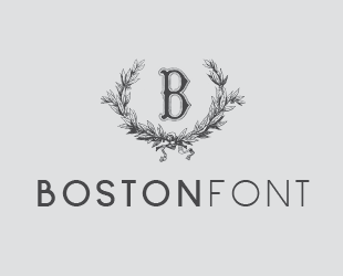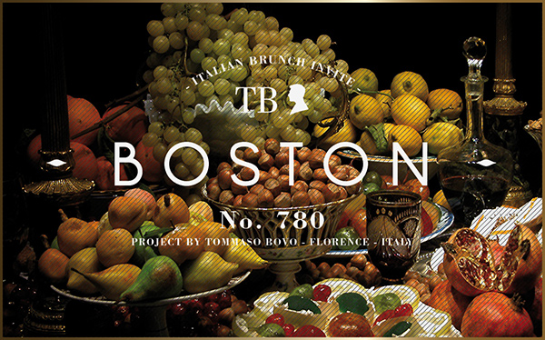
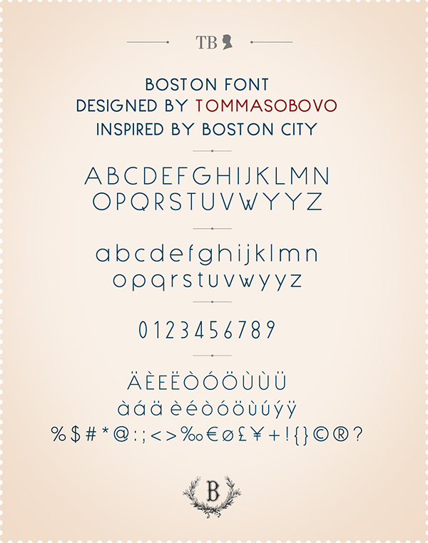
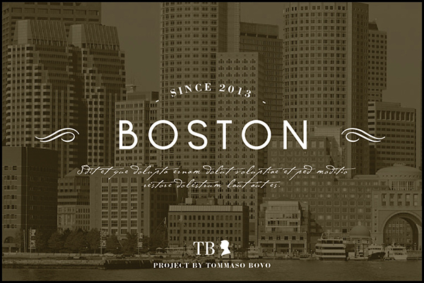

BOSTON
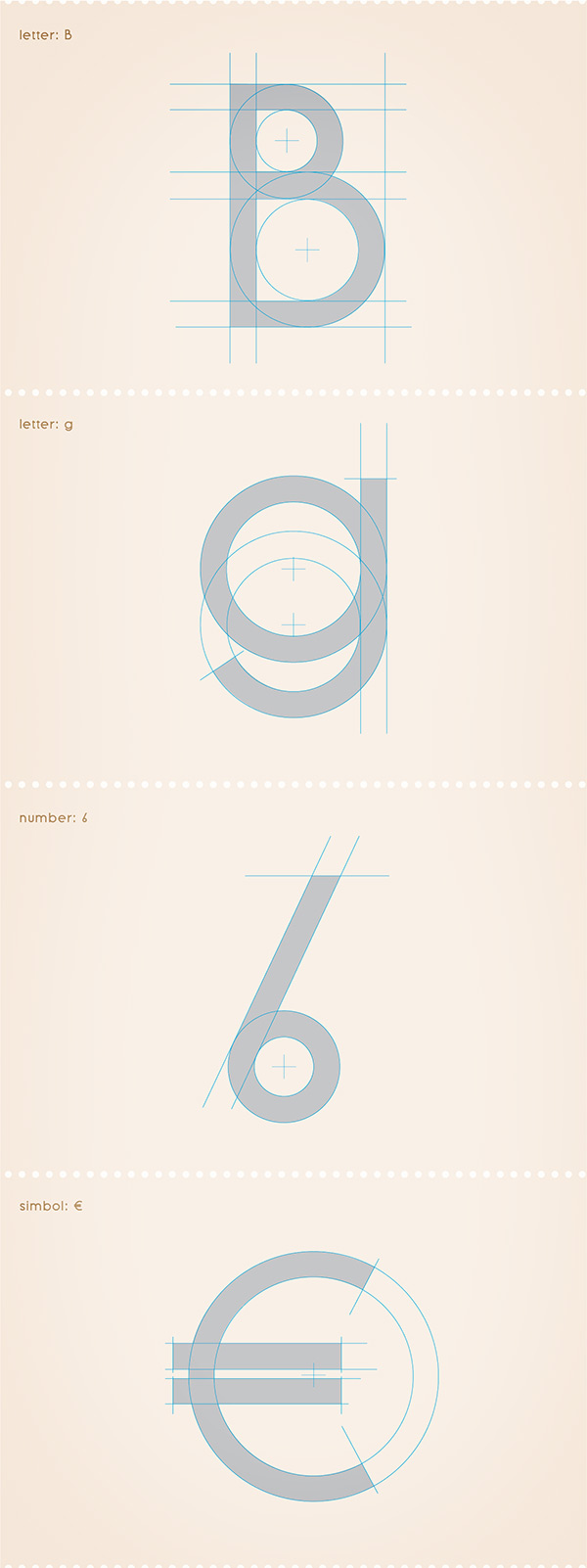
Il 15 Aprile 2013 scoppiarono due bombe durante la Maratona di Boston, da questo terribile evento nacque l’intenzione di creare un carattere tipografico che potesse celebrare questa città. Il font che ne è risultato ha forti rimandi neoclassici, è della famiglia bastone (senza grazie) ed è adatto ad essere utilizzato sia in ambito tipografico che multimediale.
On April 15, 2013, there were two explosions during the Boston Marathon. This terrible event made me want to celebrate this great city. I have used a sans-serif font for Boston, which has strong neoclassical references. It can be used in both typography and multimedia.